
OVERVIEW
A broader story. A fresh perspective.
SERVICE
Brand Identity Refresh
Color & Typography Systems
Illustration Direction
Photography Direction
Digital & Print Art Direction
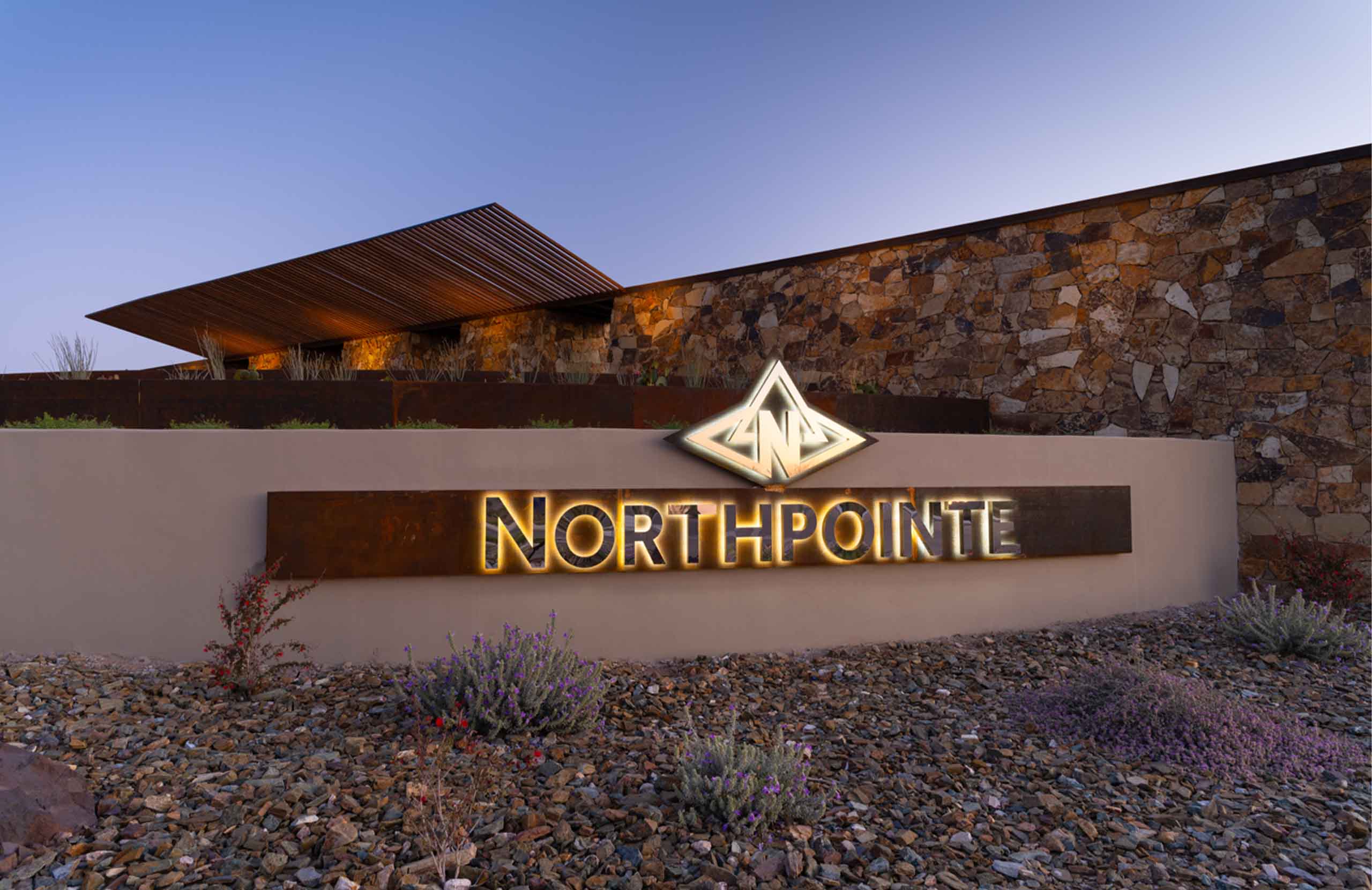
Northpointe at Vistancia had an established identity and a compelling promise: “Your Life—Elevated.” As competition grew in North Peoria and new employment opportunities brought more buyers to the area, the brand needed to communicate more of what made the community distinctive.
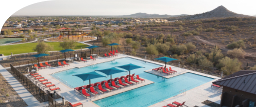
The desert setting was an important part of that story. So were the resort-style amenities, active social life, diverse home options, and connection to the well-known Vistancia community. The refresh brought these qualities together, giving prospective buyers a fuller picture of life at Northpointe.
Studio[5]Eleven developed a warmer, more expressive brand system that builds on the existing identity. Updated typography, an expanded desert palette, botanical illustrations, and personal, inviting imagery add new energy while preserving recognition.
BRAND POSITIONING
Elevated surroundings.
A connected way of life.
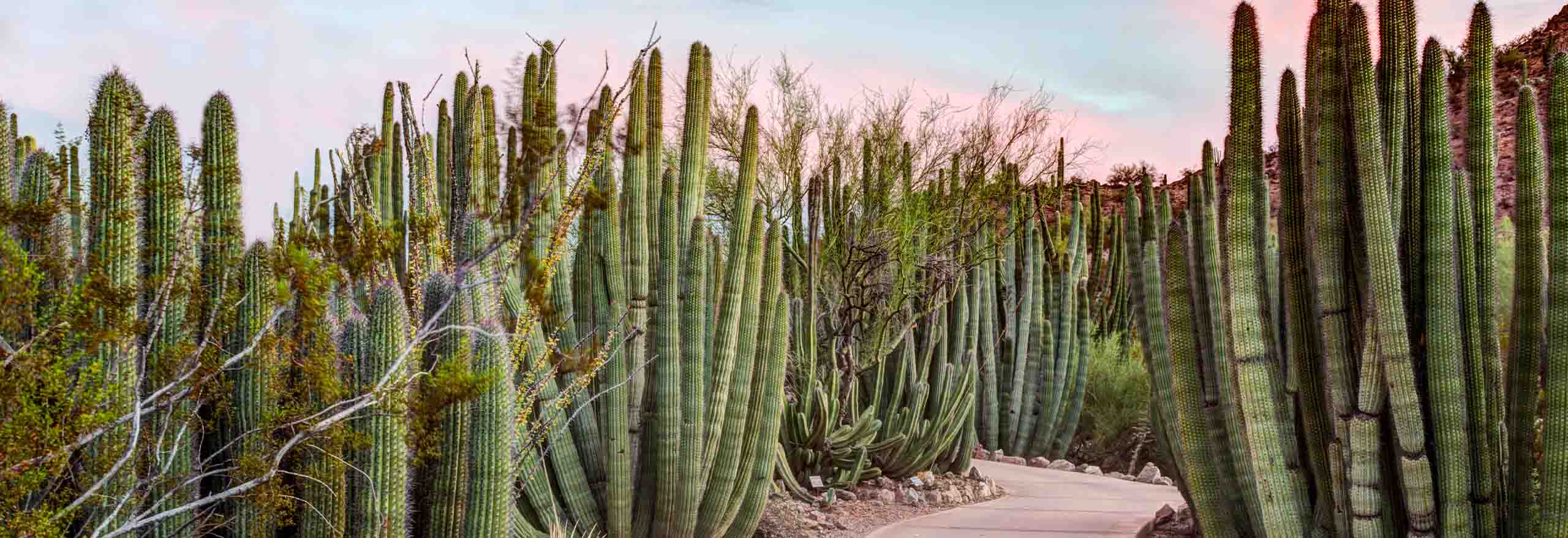
“Your Life—Elevated” speaks to both Northpointe’s setting in the Sonoran Desert mountains and the experience of living there. The refreshed direction gives equal attention to the serenity of the landscape and the vibrant community within it.
Vistancia’s award-winning reputation provides an important foundation. Its breadth of amenities, community programming, and opportunities for connection gives Northpointe a story that extends from the home to the neighborhood and beyond.
The positioning also embraces a longer view of community life. With home options suited to growing families, established professionals, active adults, and second-home buyers, Northpointe offers room for different generations and stages of life—a sense of belonging that can grow over time.
“Brad and his talented team at Studio[5]Eleven led a rebrand that truly transformed the Northpointe at Vistancia brand, bringing new life, energy and vibrancy to the brand that truly captures our promise of elevated desert living. We could not be more pleased with how every aspect came together, from our website to our advertising and collateral pieces. There is no one we would have trusted more with our brand. Brad and his team are creative problem-solvers who are collaborative, responsive and a true pleasure to work with. We are so grateful for their partnership and to have found a team that cares as much about our brand as we do.”
Shelley Smith
Senior Marketing Manager | Northpointe at Vistancia
BRAND MESSAGING
Close to what you need.
Room to get away.
The messaging connects Northpointe’s sense of escape with the practical needs of everyday life. Access to employment centers, schools, shopping, and freeways sits alongside trails, gathering places, and opportunities to enjoy the outdoors.
Proximity to TSMC and the growing North Phoenix Tech Corridor adds relevance for professionals putting down roots in the area. The story offers a balance: connection to opportunity, with space to unwind at the end of the day.
Messages such as “Love where you live” and “Discover the best of living” bring that promise into a personal, welcoming voice. Supporting language makes room for community events, shared experiences, and the small moments that give meaning to the idea of “so much life, in one place.”
BRAND IDENTITY
Familiar roots. New energy.
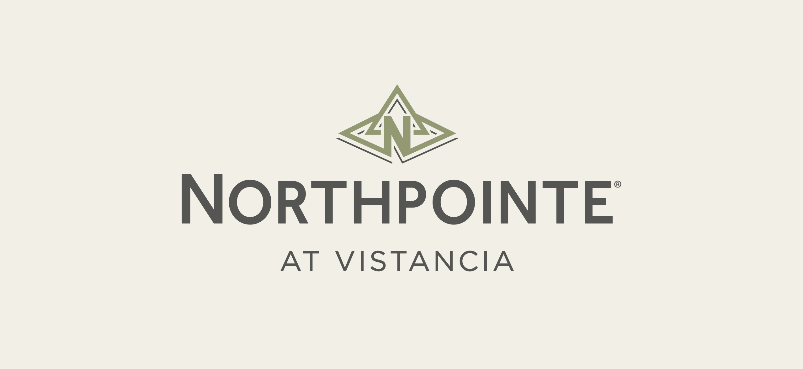
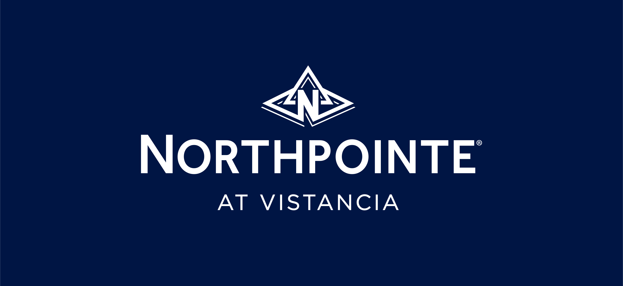
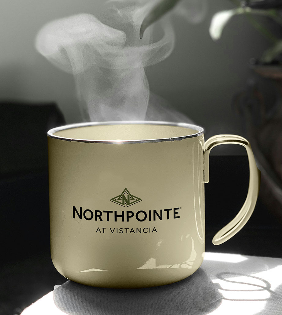
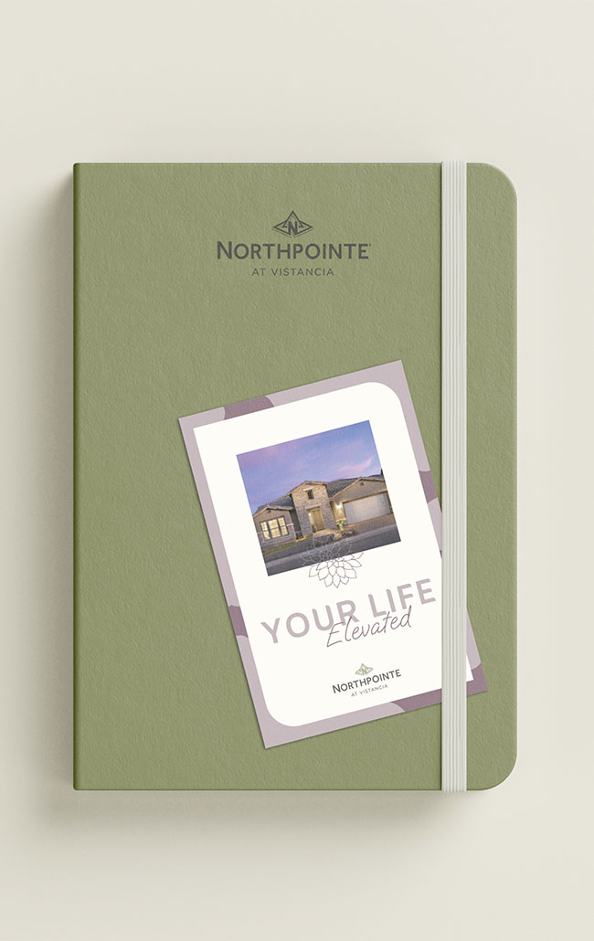
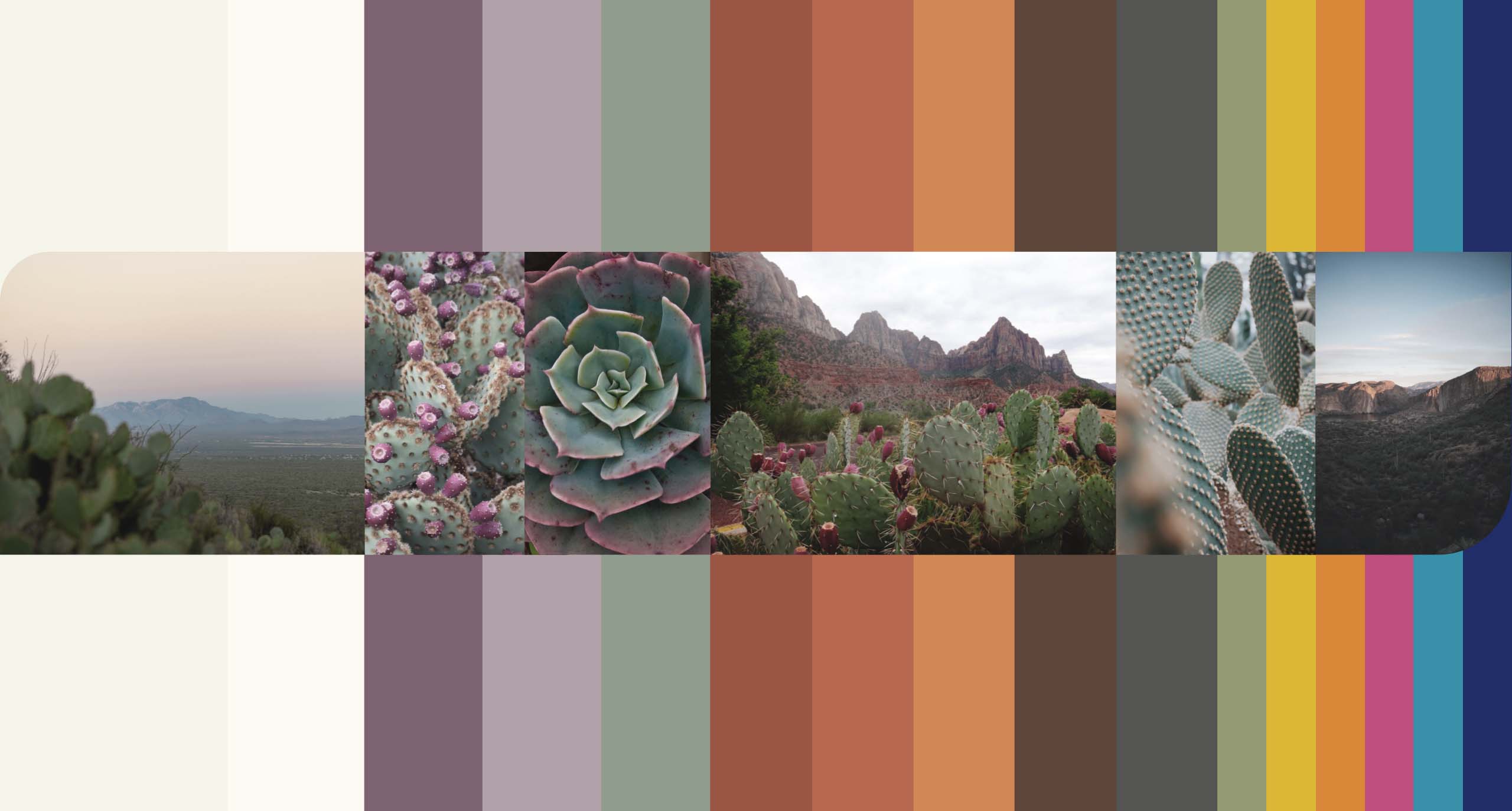
Northpointe’s original dark blue and white logo treatment was bold, but felt cool and formal. Shifting the existing logo to warmer, earthier tones established the foundation for an expanded palette of sage greens, soft mauves, desert blues, and sun-baked hues. Color became the clearest expression of the updated brand strategy, translating its emphasis on warmth, connection, and desert living into a fresh look and feel. Brighter accents add energy for events, activities, and community communications.
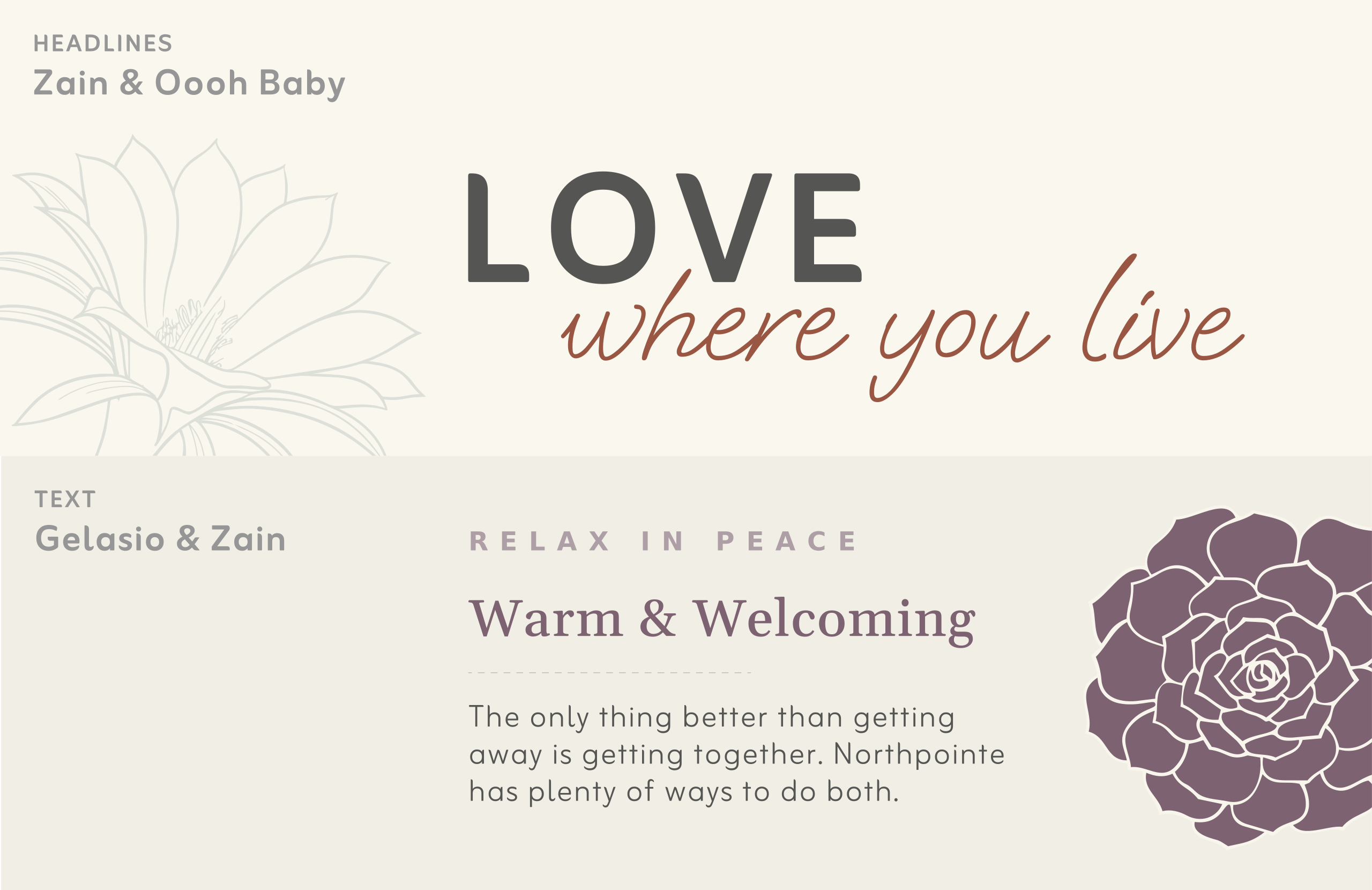
Three complementary typefaces balance refinement with approachability. Zain gives headlines a contemporary presence. Oooh Baby adds the warmth of a handwritten note. Gelasio brings an editorial quality to supporting headlines and longer passages.
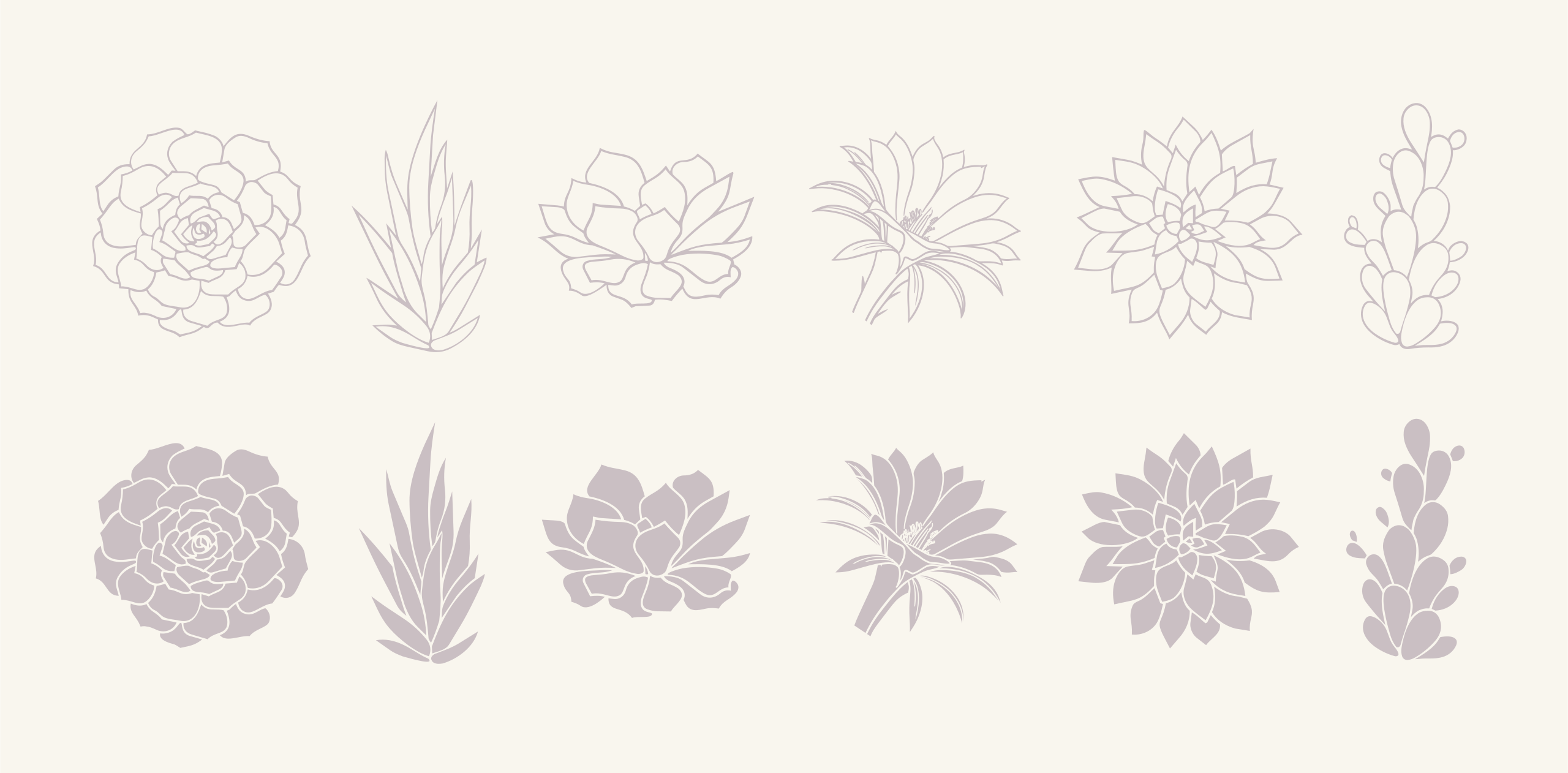
Rounded corners, generous space, and botanical illustrations extend that warmth throughout the system. Together, these choices create a welcoming identity that feels connected to the landscape and the life within the community.

PHOTOGRAPHY & VIDEOGRAPHY
A place to picture your life.
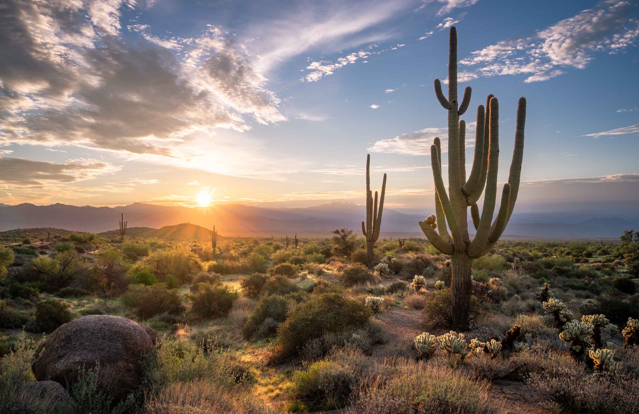
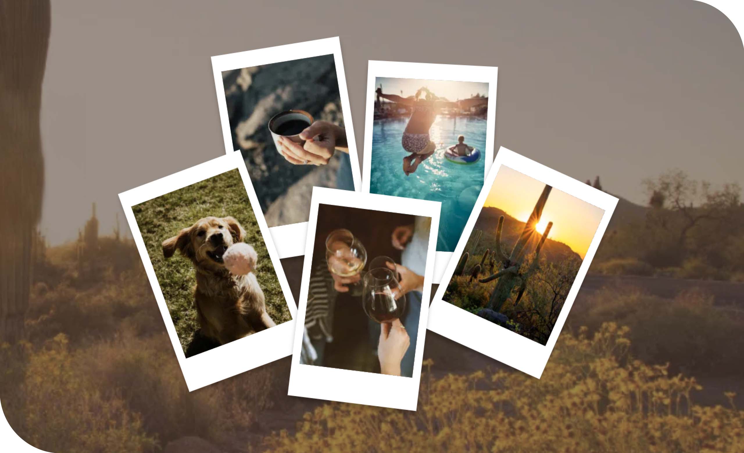
The photographic direction brings Northpointe’s two defining qualities into view: a peaceful desert setting and an active, connected community.
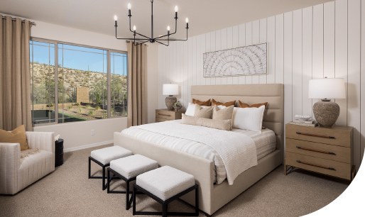
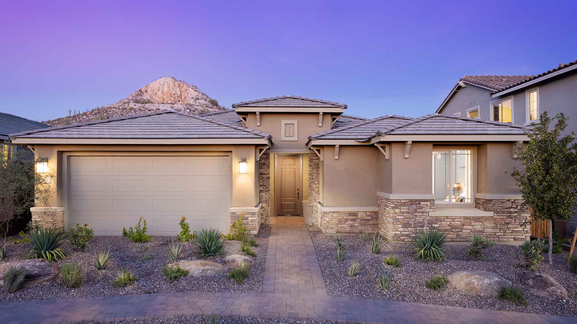
Expansive mountain views and light-filled homes establish a sense of place. Images of neighbors gathering, families exploring, and residents enjoying everyday routines make that setting personal. Quiet moments share space with the energy of recreation, events, and time together.
The direction also calls for a broader representation of the people Northpointe welcomes. Different generations, household types, and cultural backgrounds—including a community of professionals and families, growing with diversity—help the imagery reflect an evolving audience. The aim is a natural, inclusive portrait of life here, with moments prospective residents can recognize as their own.


BRAND APPLICATION
One community. Many ways to connect.
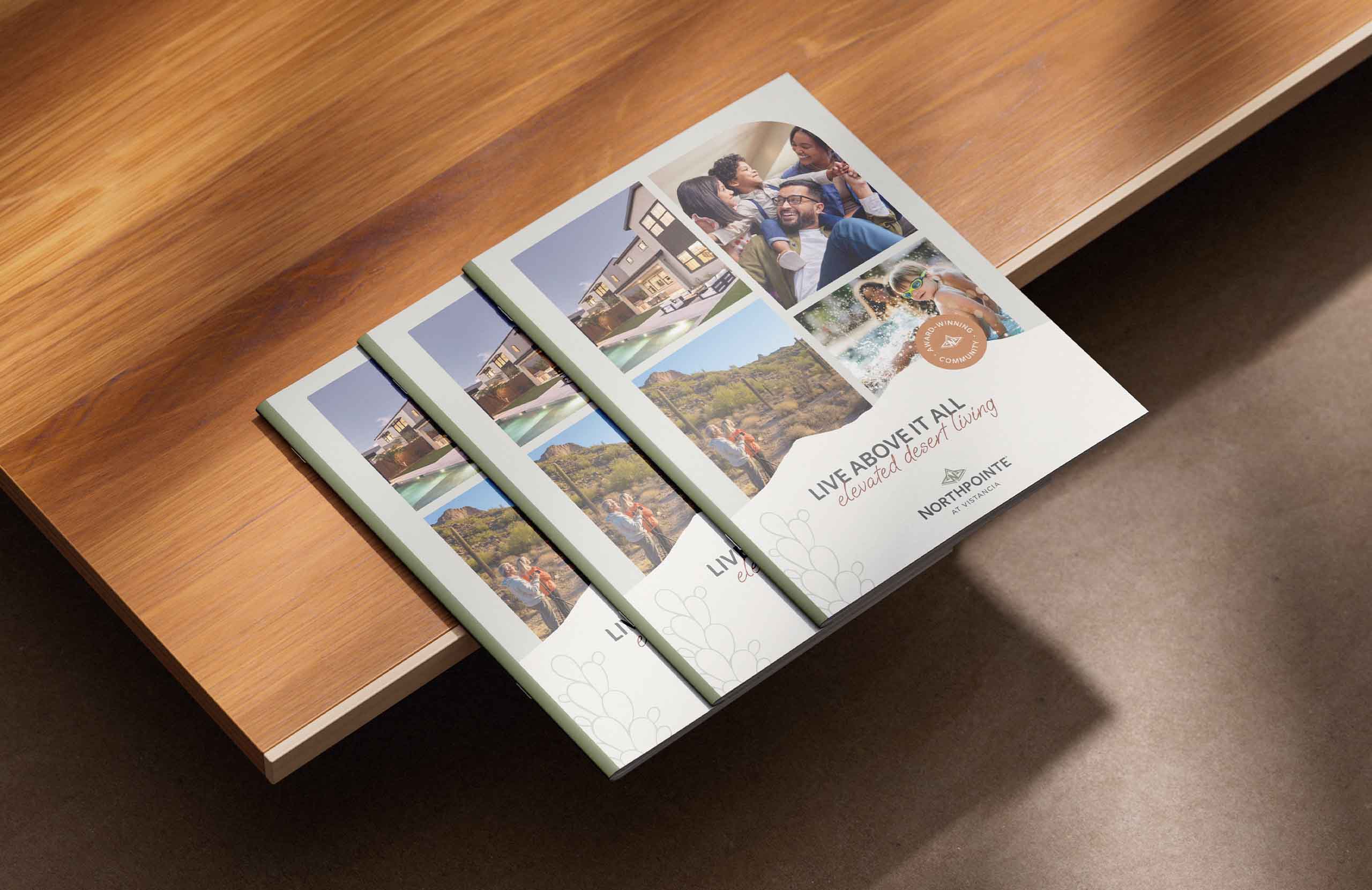
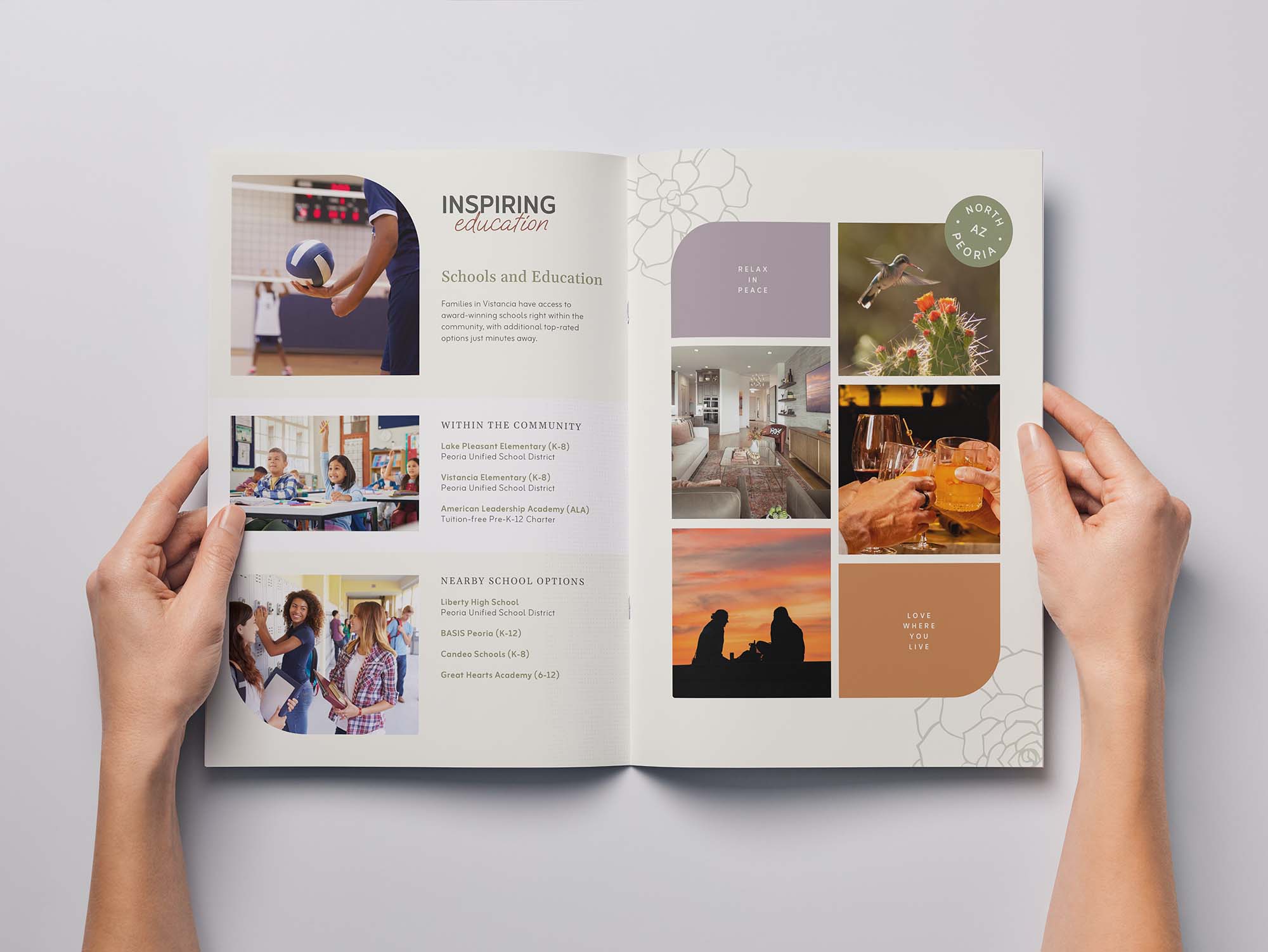
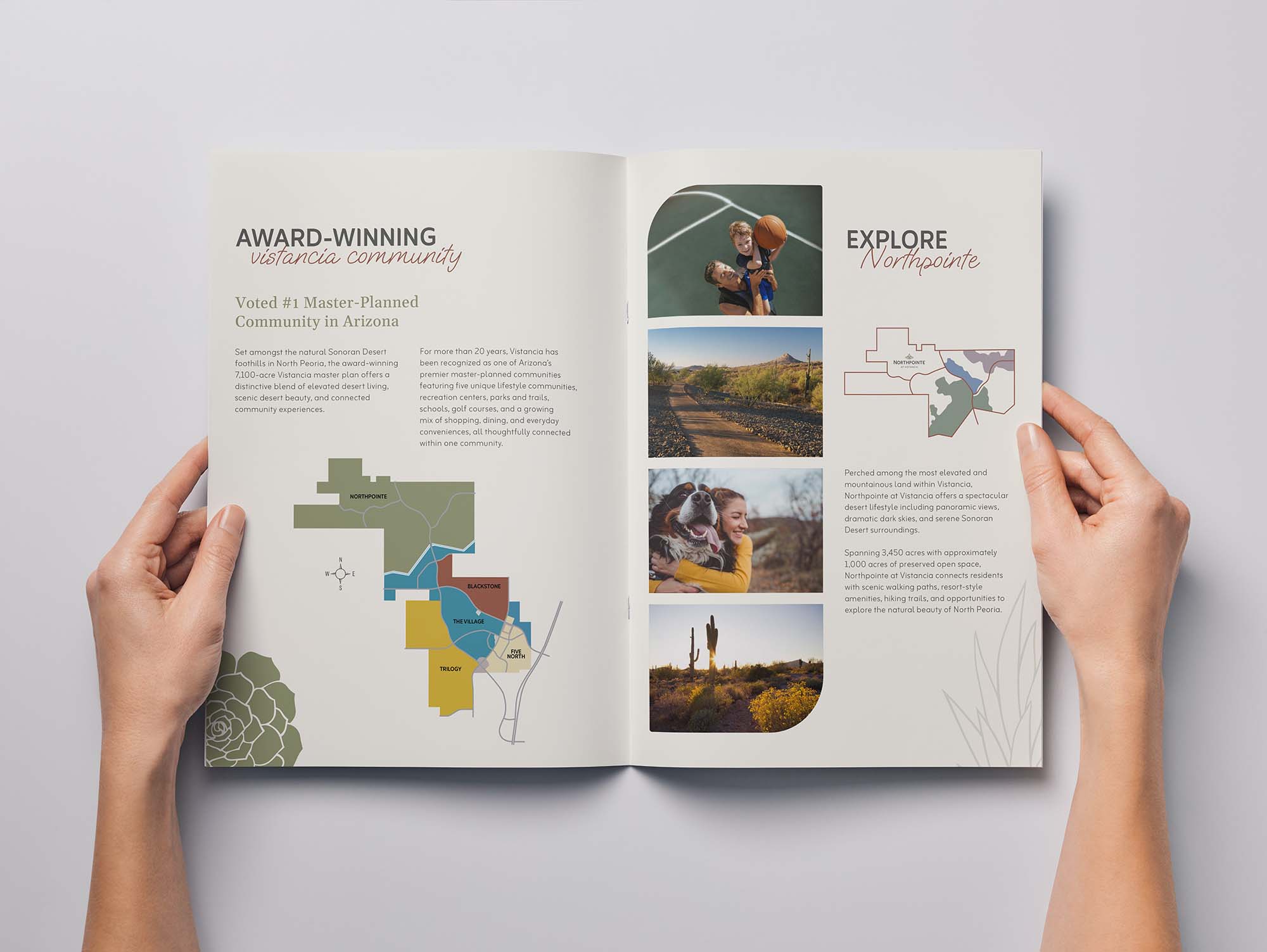
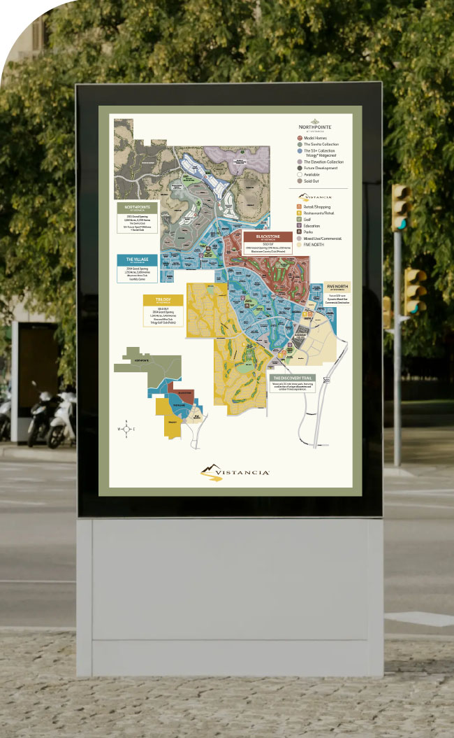
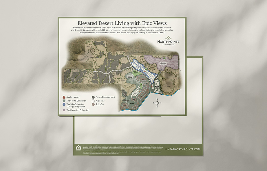
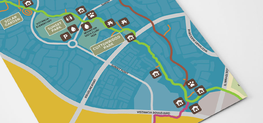
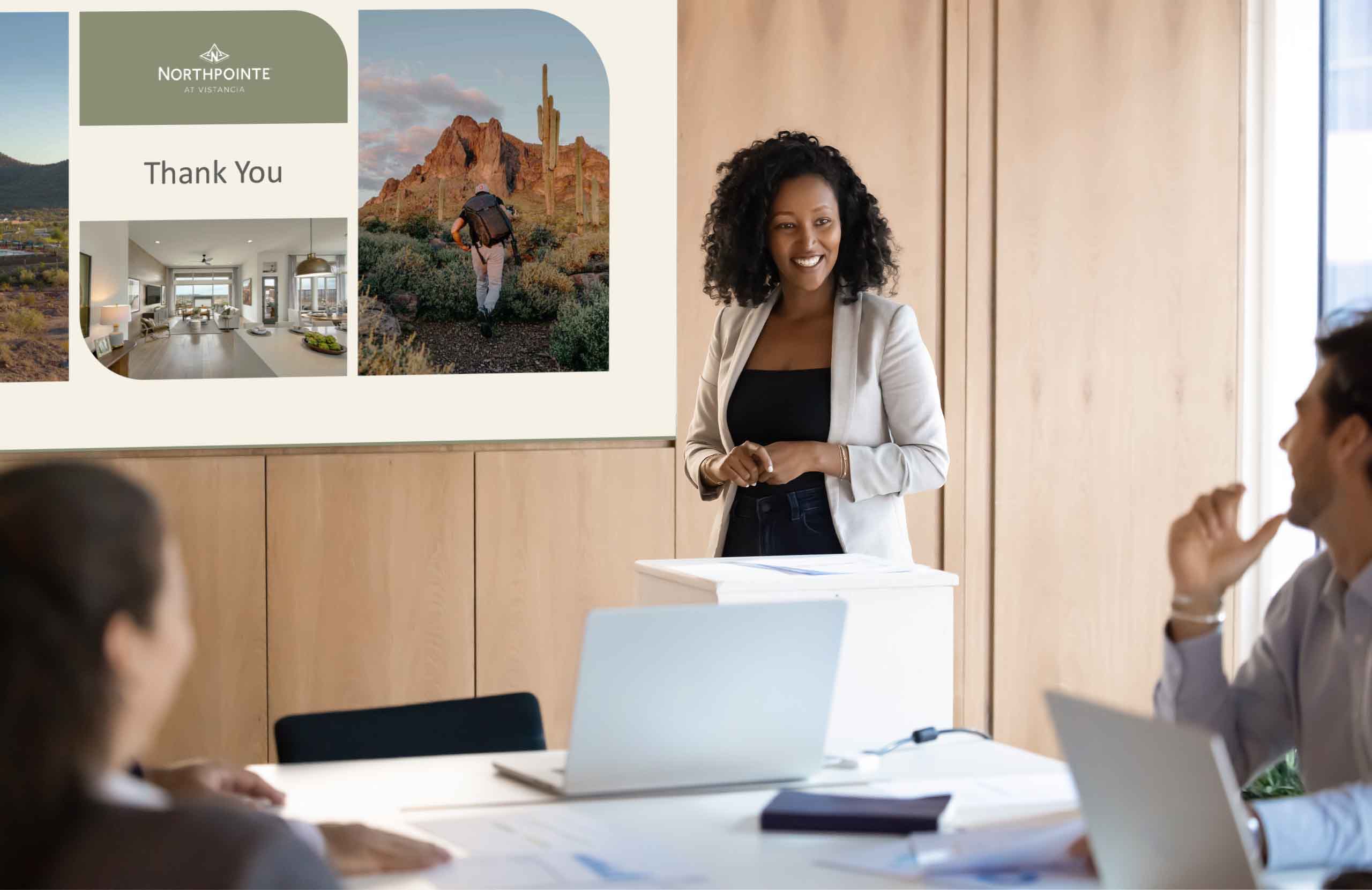
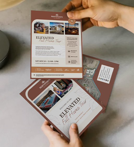
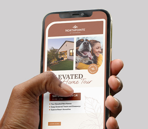
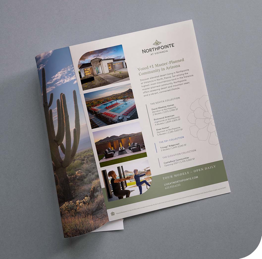
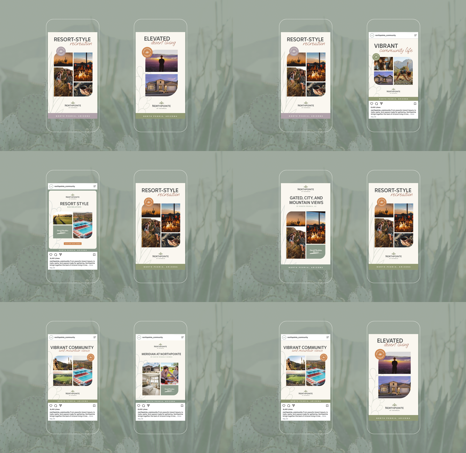
The refreshed system gives Northpointe a flexible foundation for reaching homebuyers, residents, and Realtors across print, outdoor advertising, and digital communications.
The visual language can support a quiet introduction to the landscape, an energetic community event, or practical information about homes and amenities. Color, imagery, and illustration adapt to the subject while consistent typography and layout details hold the brand together.
Coordinated builder logo treatments support the range of home choices within the community. Across applications, the relationship to Vistancia remains clear, helping Northpointe draw on the broader community’s reputation while expressing its own character.
WEBSITE DESIGN
A fuller picture, from the first visit.
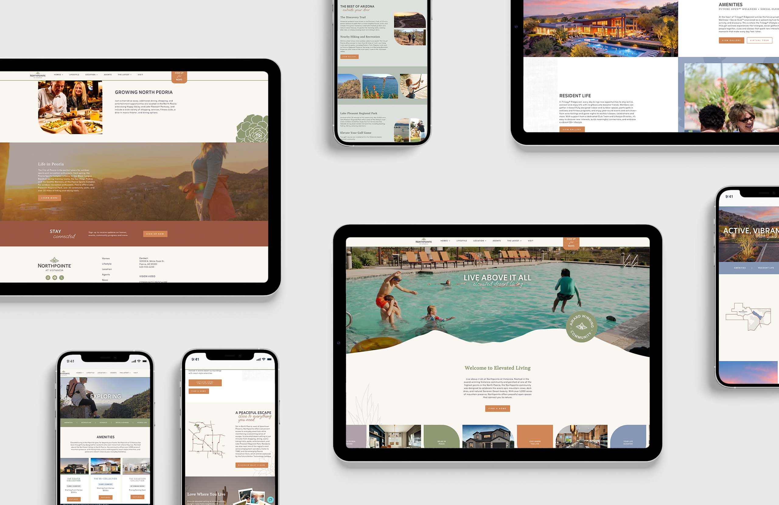
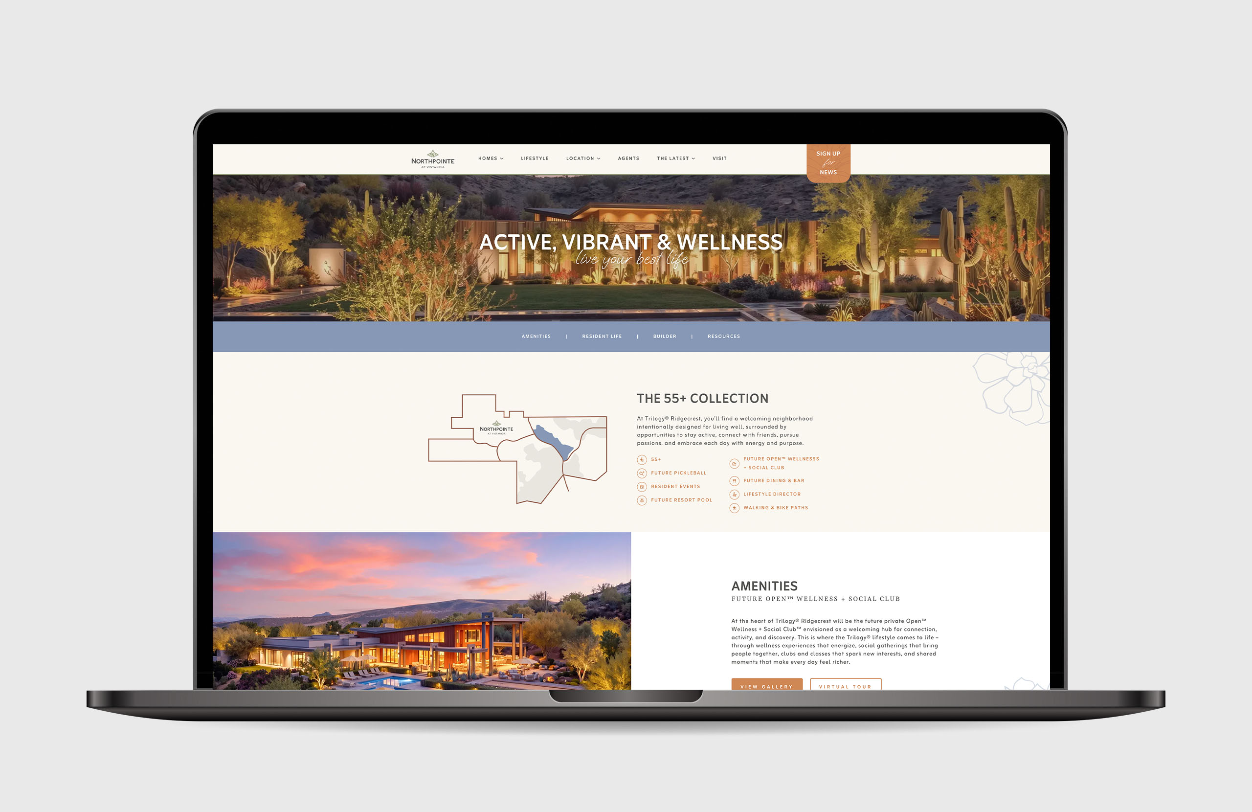
The new website and online advertising designs show how the refreshed identity can create a warm, approachable digital experience. Clear typography, softly framed imagery, and botanical details bring the community’s character to the screen.
The content direction invites visitors to explore the full picture: homes, resort-style amenities, community programming, outdoor recreation, and connections to everyday conveniences and employment. It gives buyers at different stages of life useful ways to understand how Northpointe might fit their needs.
From an initial impression to a closer look, the experience supports the same goal as the broader refresh: helping people see both the beauty of the place and the possibilities of belonging there.
Your source for brand direction that drives traffic.
Eager to launch a product or service, re-envisioning an existing brand, or looking for increased customer engagement?
Contact Us
Office | 602.456.0175
Inquires | info@studio5eleven.com
Careers | careers@studio5eleven.com
Work | Books | Services | Experience | About
Studio[5]Eleven is a registered trademark of Studio 5 Eleven, LLC © 2026